Royal Bank of Canada
Senior UX/UI Designer
What I do at RBC?
I work on the user research and UI designs for the company’s intranet websites, including the intranet home page (where employees get company news, important announcements, updates, events, job tools, and more), HR portal, business department sites, and the company’s “chatGPT” platform.
As my work is on the company’s internal sites, I have gotten permission to share the following project in a private setting with a few details censored:
If we have an opportunity to meet/chat, I would be happy to discuss my work processes and describe the design concepts.
Onboarding initiative for 4500 new employees on the same day
Upon RBC’s acquisition of HSBC Canada, a project was initiated to improve the company’s current onboarding process to prepare for the entry of 4500 employees from HSBC Canada.
My Roles:
Research & Design Lead
QA Analyst
Tools:
Mural
Figma
Google Analytics
Team:
4 UX Designers
2 UX Researchers
2 Product Owners
2 Developers
2 QA Analysts
Timeline:
5 months
Project Overview
Problem Statement:
With 4500 new employees from HSBC Canada joining the company on the same day, the company was facing the largest number of employees onboarding. With drawbacks to the current onboarding process, there is a risk of a significant number of support calls and decreased new employee satisfaction.
Objectives:
Improve the onboarding process (HSBC + RBC new employees)
Make new employees feel welcome and supported
Provide an all-in-one entry point to all onboarding materials
Round 1: User Interviews + Wireframe Testing
Research was conducted with new employees who joined the company within 3 weeks at the time of each round of testing
Participants were chosen from different departments in the company to ensure feedback was received from a range of employees.
User Interviews Findings:
Don’t have one single source of onboarding information
Scattered sites make it difficult to locate information
Unsure of support contact for HR or technical issues
Want onboarding resources to help them get on board faster and smoothly
Ideation/ Wireframing
With the interview findings, we had collaborative ideation sessions and came up with 2 products to tackle
Wireframe Testing Findings
Pop-up
Concerns about being intrusive
May not have time to look through resources right away (blocks the home page)
Unclear what info can be found and what value it brings
Unsure where they can locate those links after closing
Product 1: Introducing a welcoming pop-up on the home page (first thing new employees see when they open their browser)
Product 2: New onboarding page in the HR portal; providing resources and tips to help with the onboarding process
Onboarding page
Shorter page (low readability)
Not engaging (content + aesthetics)
Prefer more links to click (bringing them to the right resource)
Round 2: Task-based usability testing + Final Designs
[confidential info removed]
Product 1: Adding another version of the pop-up for 2+ times view
Change in wording + less text
Allowing users to “never see pop-up again” + add onboarding resource link to their favorites (home page quick links)
Product 2: More polished content, adding resource links and FAQs, updated designs with more icons and graphics
Usability Testing Findings
Pop-up
No issues with interactions (standard experience)
Lack of engagement with text under header
Don’t read before check boxing and closing pop-up
Not realizing the onboarding link is saved in their quick links for easy access
Positive feedback on design (simple, feel welcomed)
Onboarding page
Still too much text, difficult to skim through
FAQs lacking specific issues encountered
Welcome banner text heavy, does not articulate what this page is about
Results
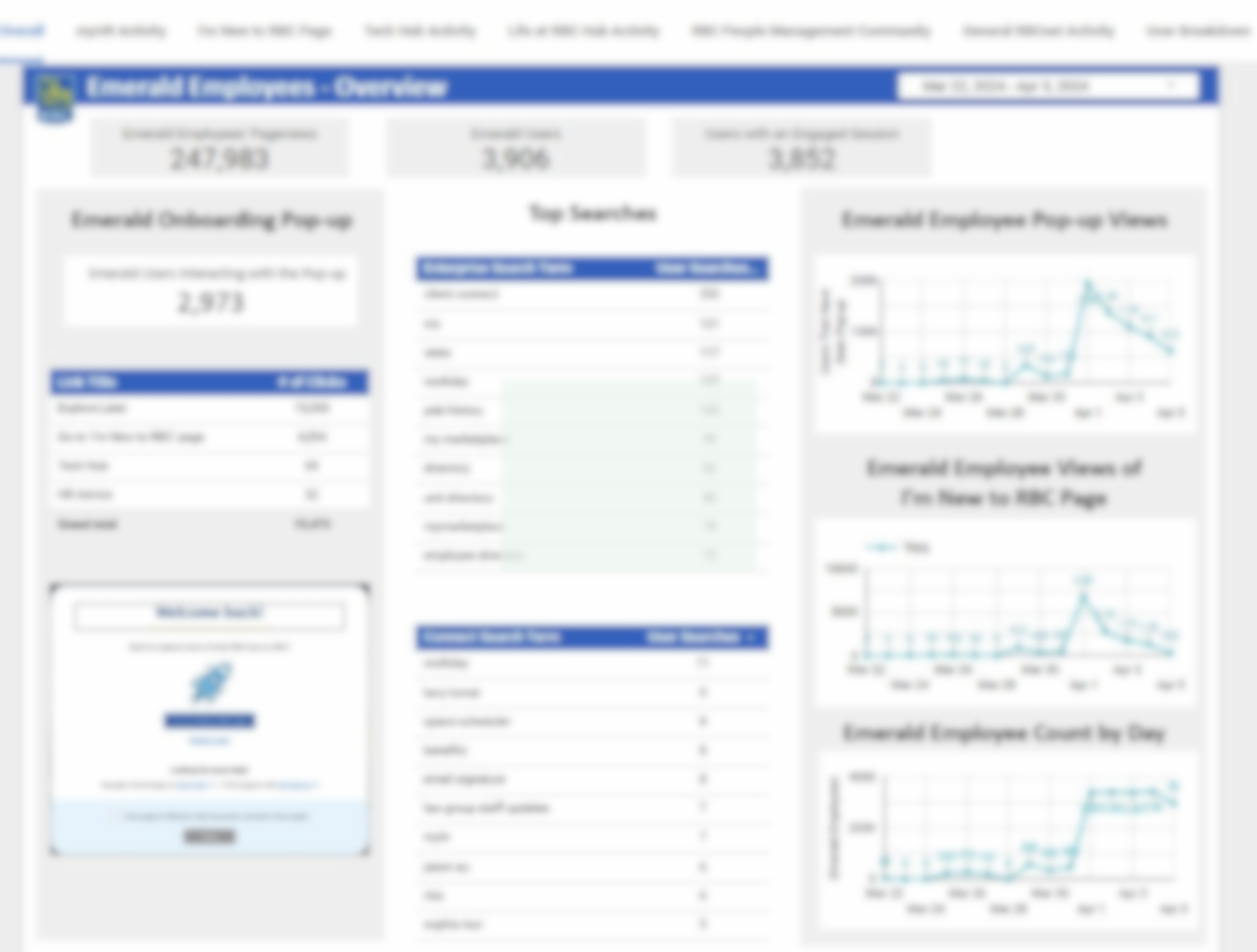
Due to confidential information, I am unable to show the numbers that were tracked on Google Analytics.
What I can share is that the results were a success!
Within the first week, over half of the 4500 new employees engaged with the welcoming pop-up and viewed the onboarding info page 4+ times on average.
Reflection
Challenges
-
With a set budget on the project, we had to ensure the scope of the project does not exceed the budget. We also did not want to reinvent the wheel, scraping anything that is currently working.
-
The project timeline was 5 months for the full project to be executed. Due to the acquisition, any releases for internal sites are limited, leaving us only 1 chance to get things right before HSBC employees join.
-
There were 2 Product Owners for this project, one in charge of the transition of HSBC to RBC employees and another from HR. At times, due to differences in opinions, I had to find the middle ground, yet come up with a design solution that addresses user needs + business needs.
Learning Opportunities
Well-rounded work
Built research and design plans
Executed testing, analysis & design workshops
Involved in UX copy based on research findings
Conducted QA testing
Leadership
Led team research analysis collaboratively
Facilitated design workshops with a team of 9 designers
Led communications with Product Owners, developers, and other designers throughout the project
[All the information presented has been reviewed with the company before sharing]
Thank you for taking the time to look over the project!


